

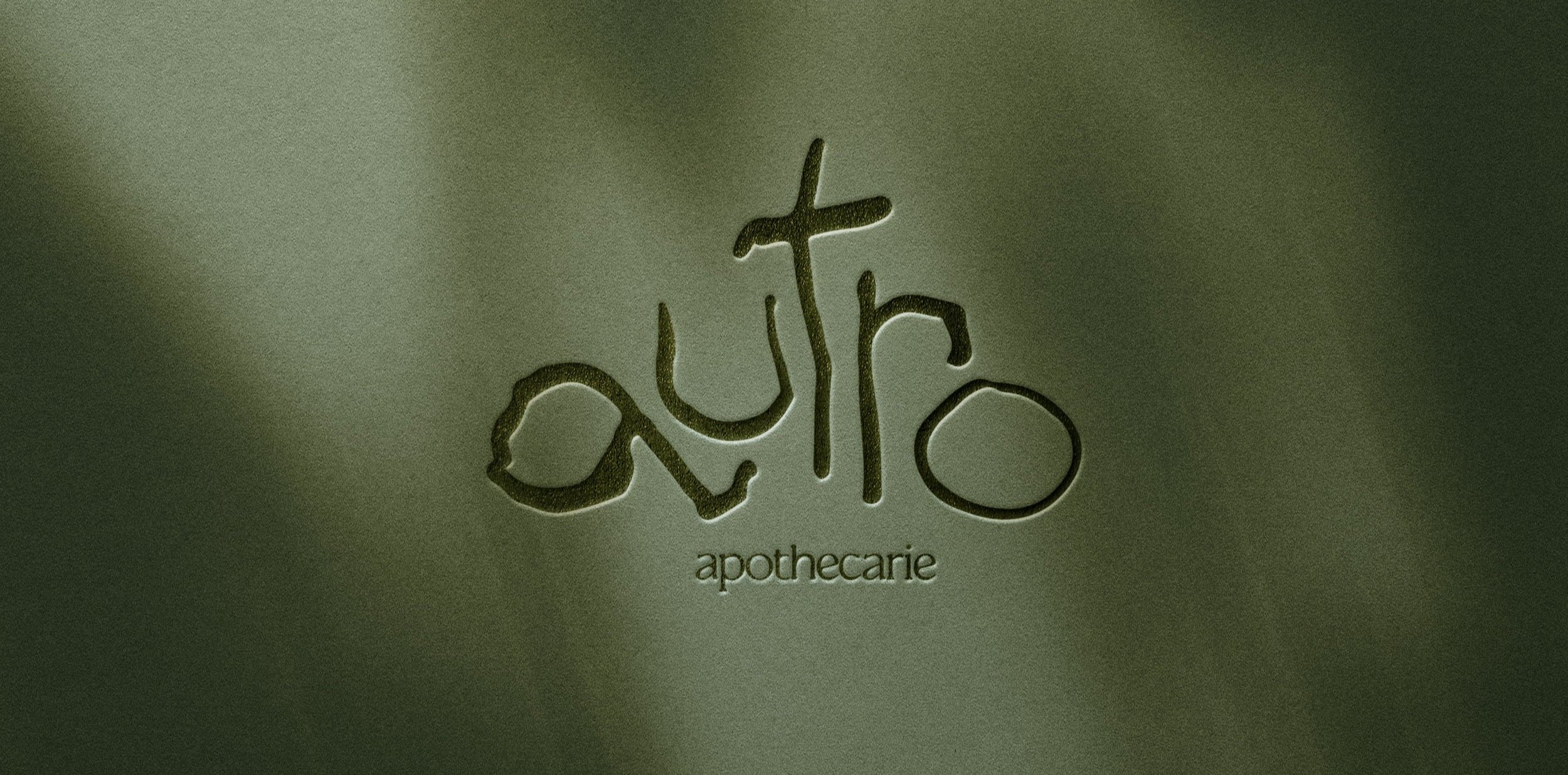
In a line: Autro Apothecarie is a speculative cosmetics brand grounded in dark naturalism.
A few more lines:I have this recurring fantasy where I am wandering a dark forest. I step over wet moss beds, a light rain beating on the canopy. Sun barely breaks through. The whole scene is cast in a hazy, murky twilight. The air smells of soil. The Ruldo Forest theme from Lost Kingdoms II plays in the background. (The game is most certainly the source of this reverie.)
In this fantasy, I eventually find myself at a small apothecary, candle-lit and full of mystical potions and ampules. There are creams and salves and tonics, all born from the land around me and formulated in secret. In utter isolation.
Autro is a small manifestation of this daydream, and an answer to the question: what might be among those mystical shelves? And what secret remedies might await us in the deep, dark corners where very few tread?
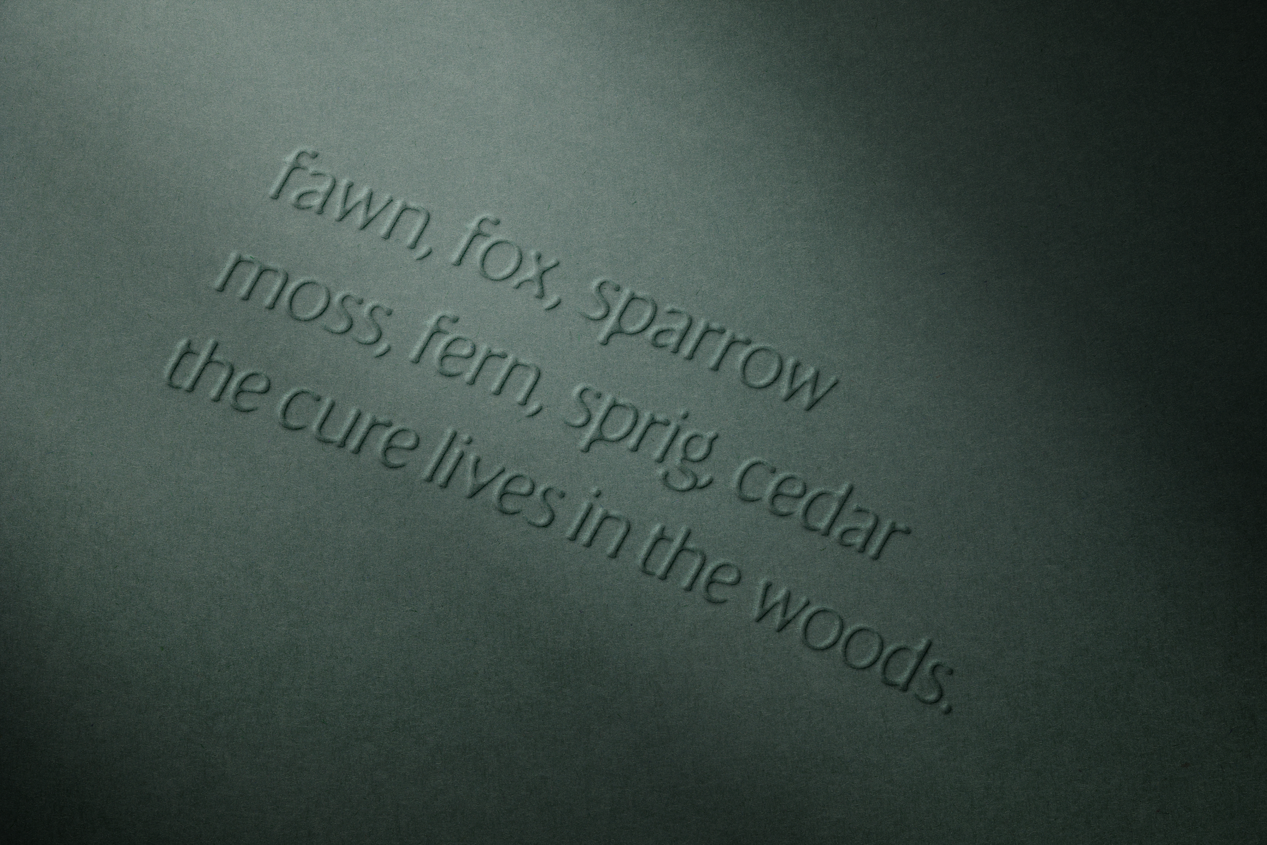
About the nameAutro is an archaic provincial French term roughly translating to “other.”
Choosing an archaic term was intentional: I wanted to create a brand that evoked the eras of yore when mysticism and magic still lurked — on the outskirts of town, in the dark pockets of the woods, in candle-lit foyers.
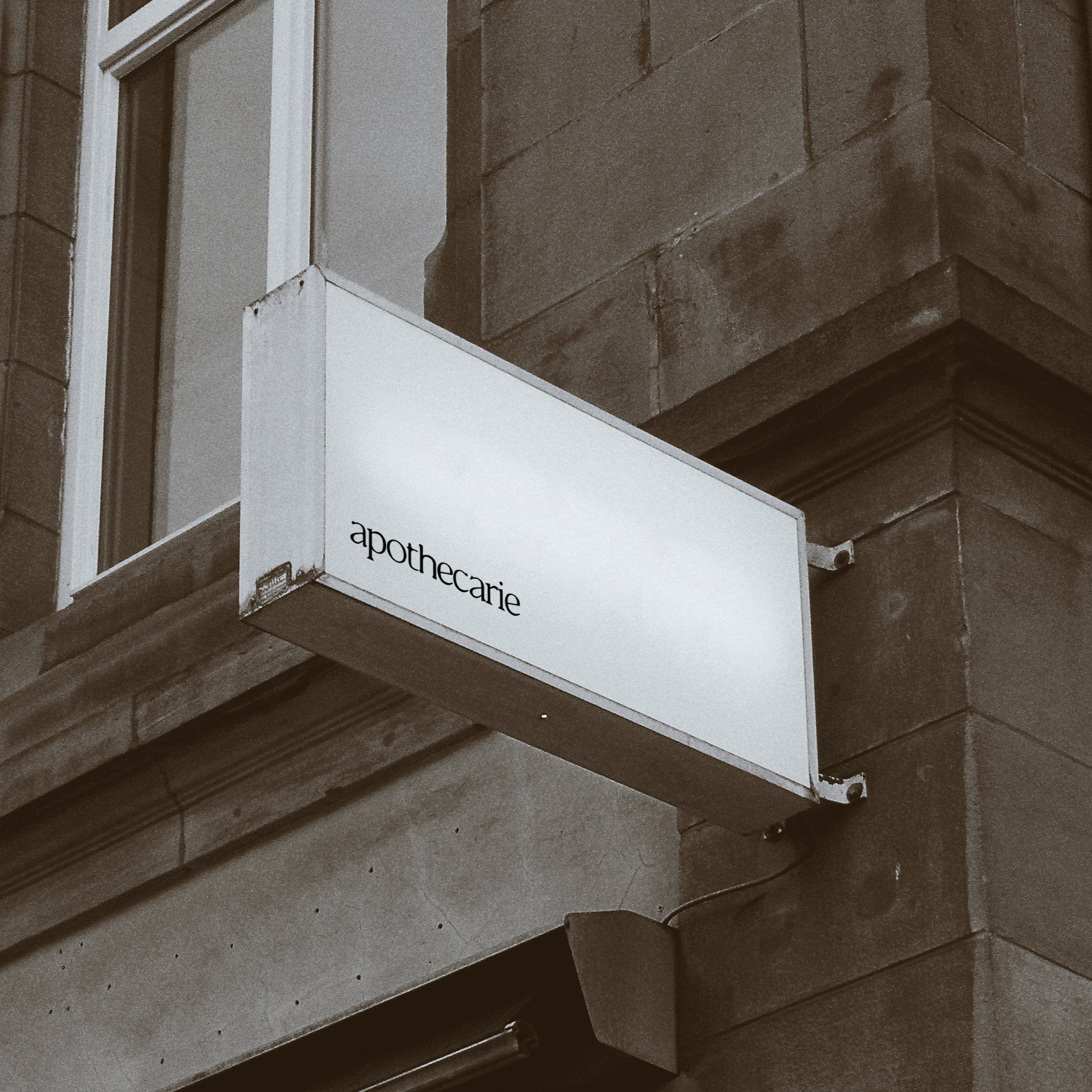
We carry this approach forward in “apothecarie” as well, another archaic spelling that serves to elevate and distinguish the brand.
Brand FoundationsAt its essence, Autro is a curious explorer. It invites people to probe the dark, the murky, and the mysterious. Its products aim to surface beauty, but we define beauty our own way, riding a tantalizing line between modern cosmetology and ancient study.
If it were real, Autro would source unlikely ingredients, showcase antique recipes, and challenge the standards of what good looks like or should be. Artists and botanists alike, we are focused on potency over scarcity, and efficacy above all.
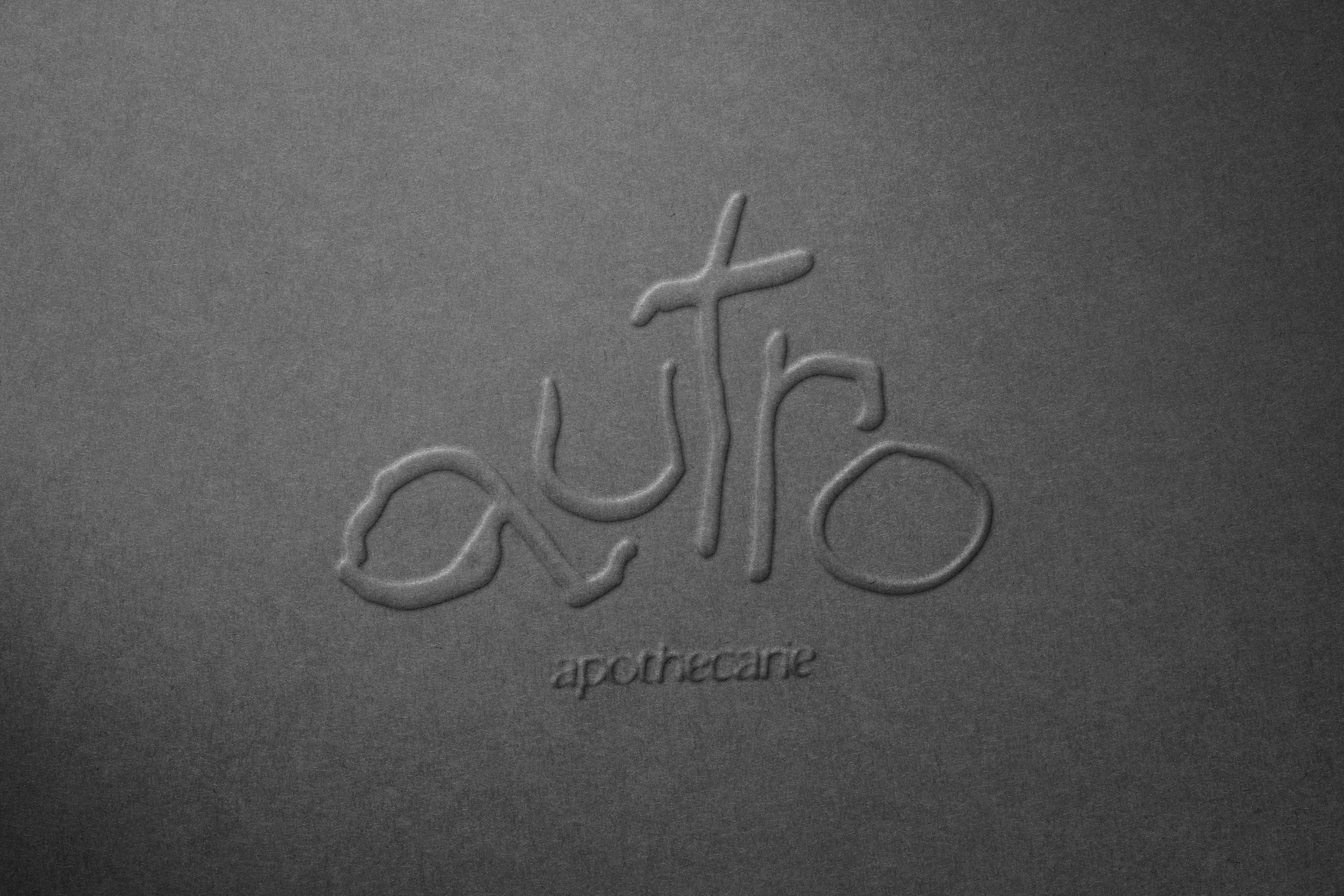
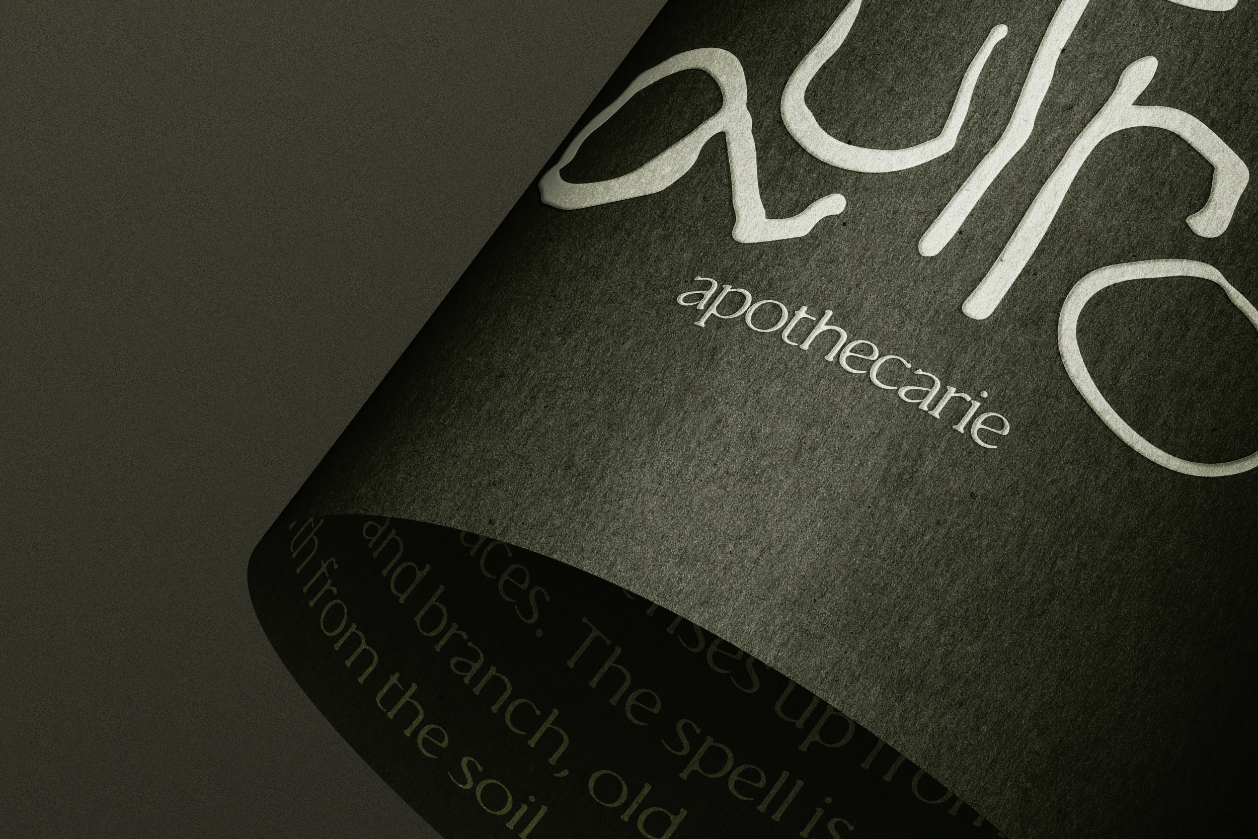
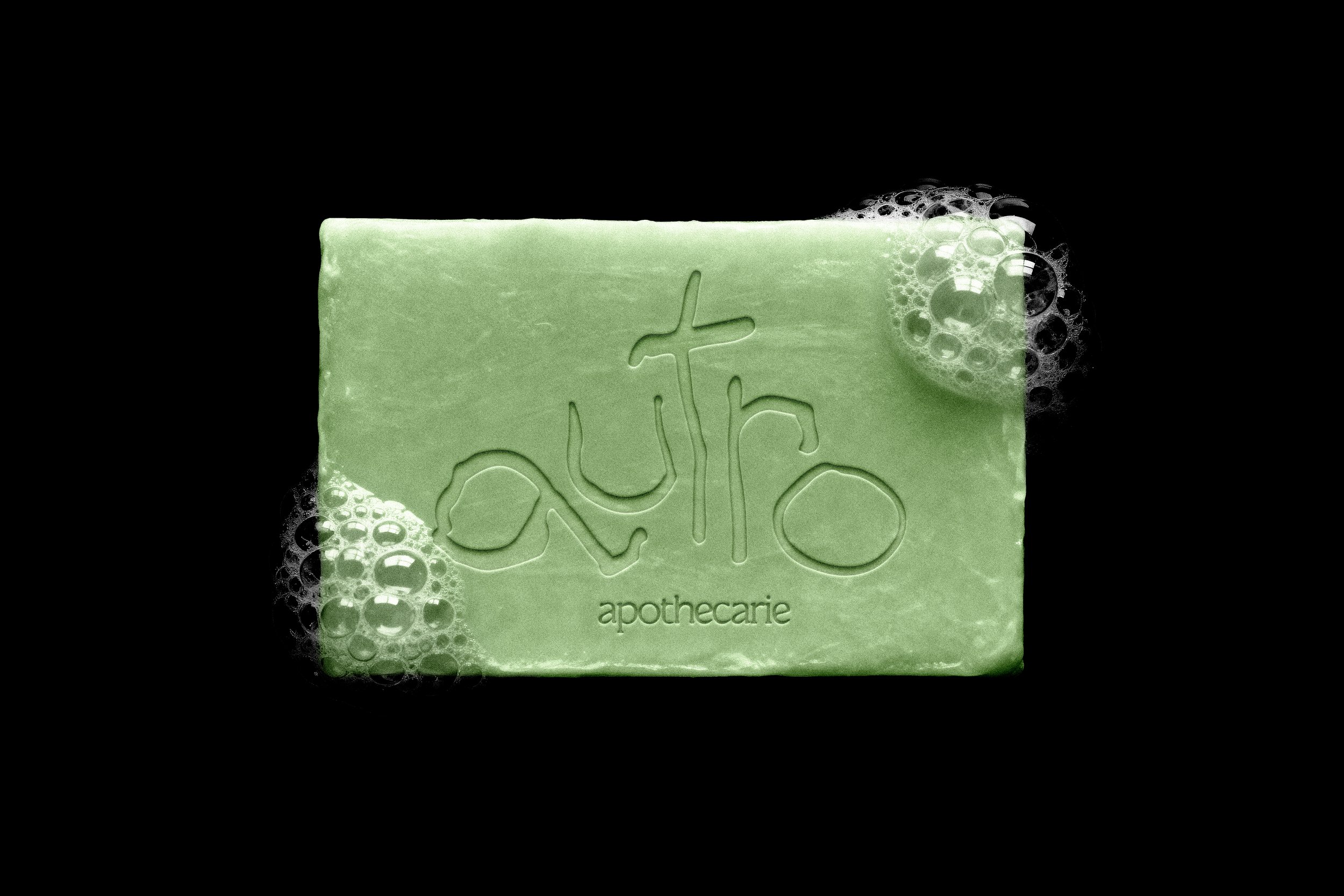
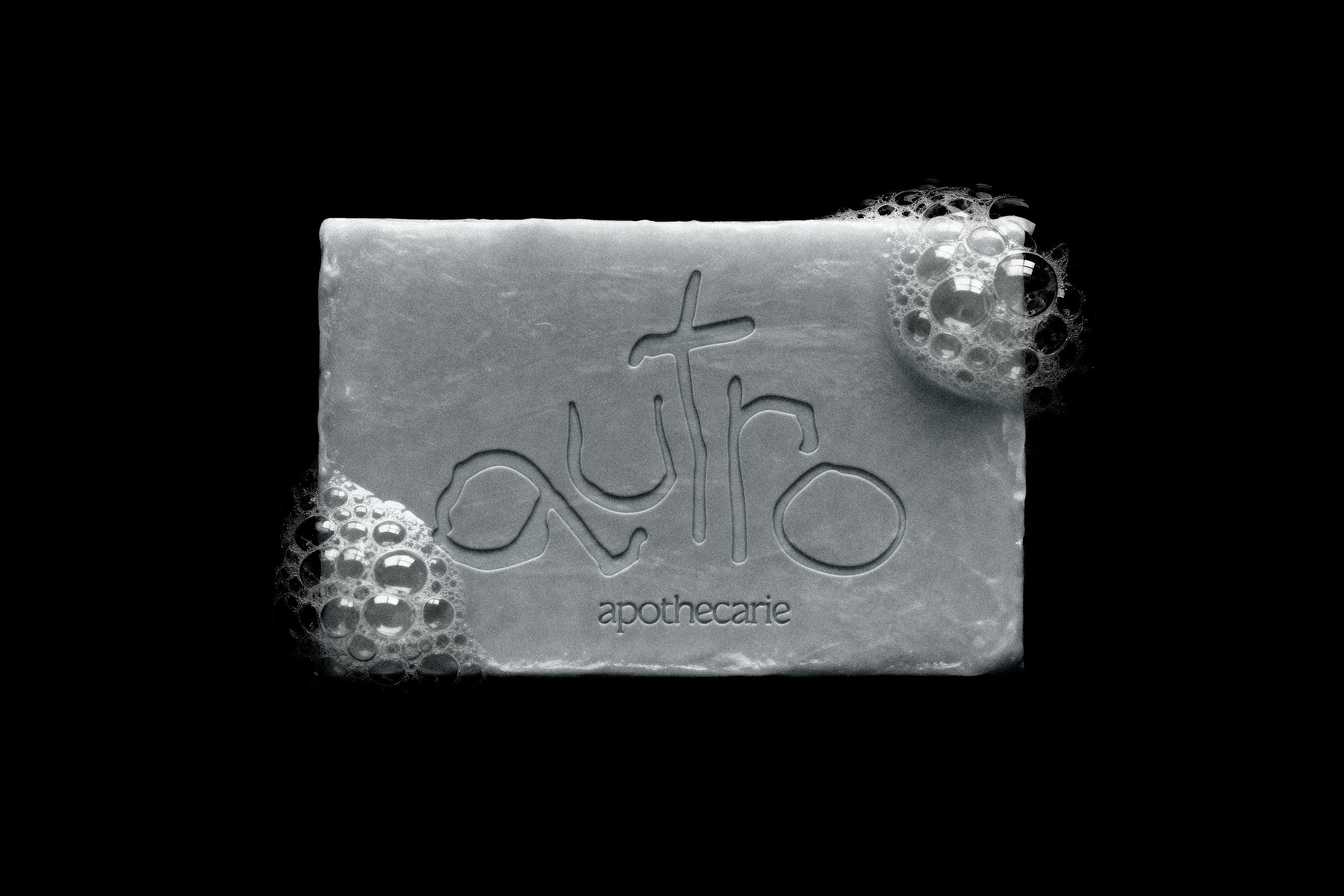
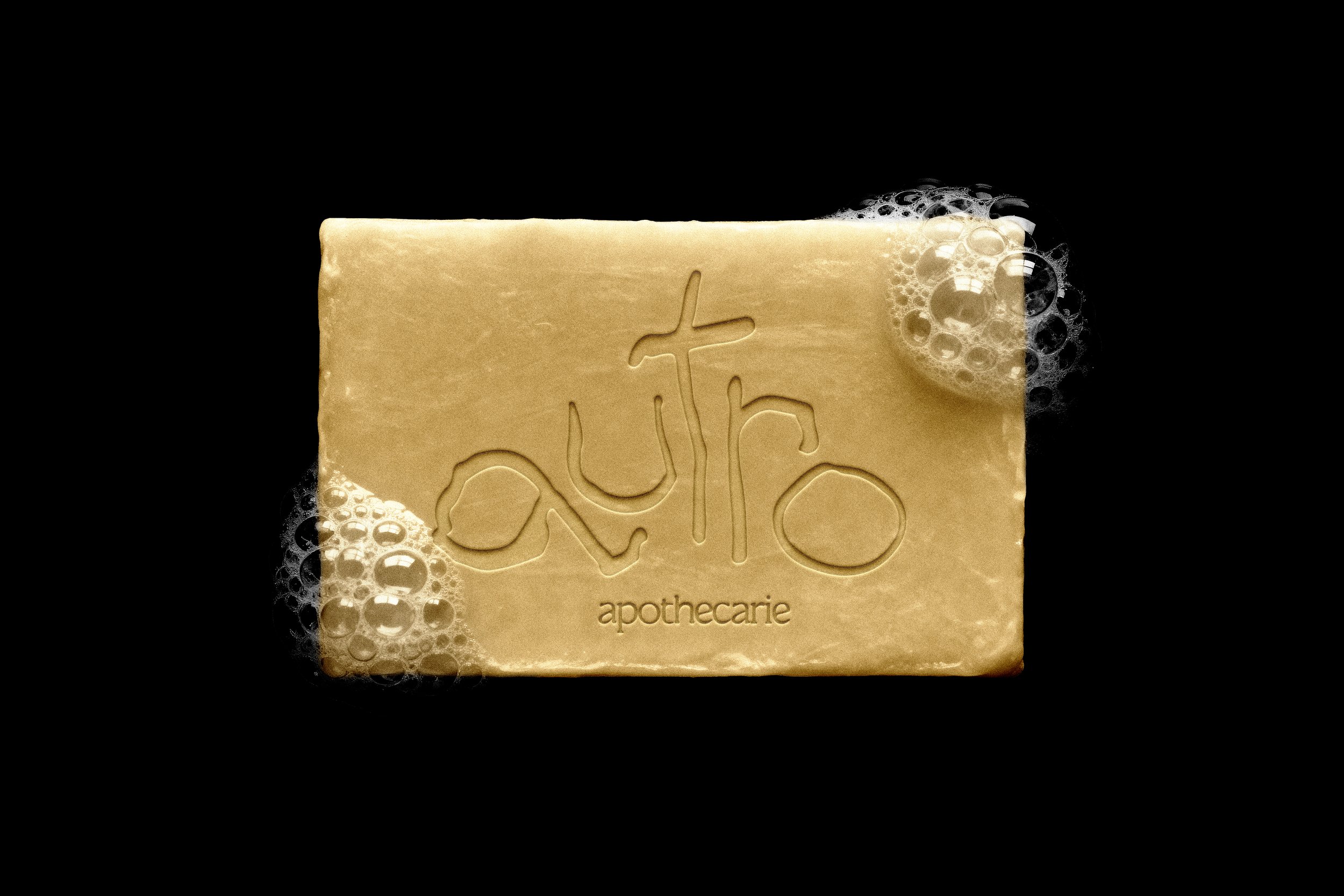
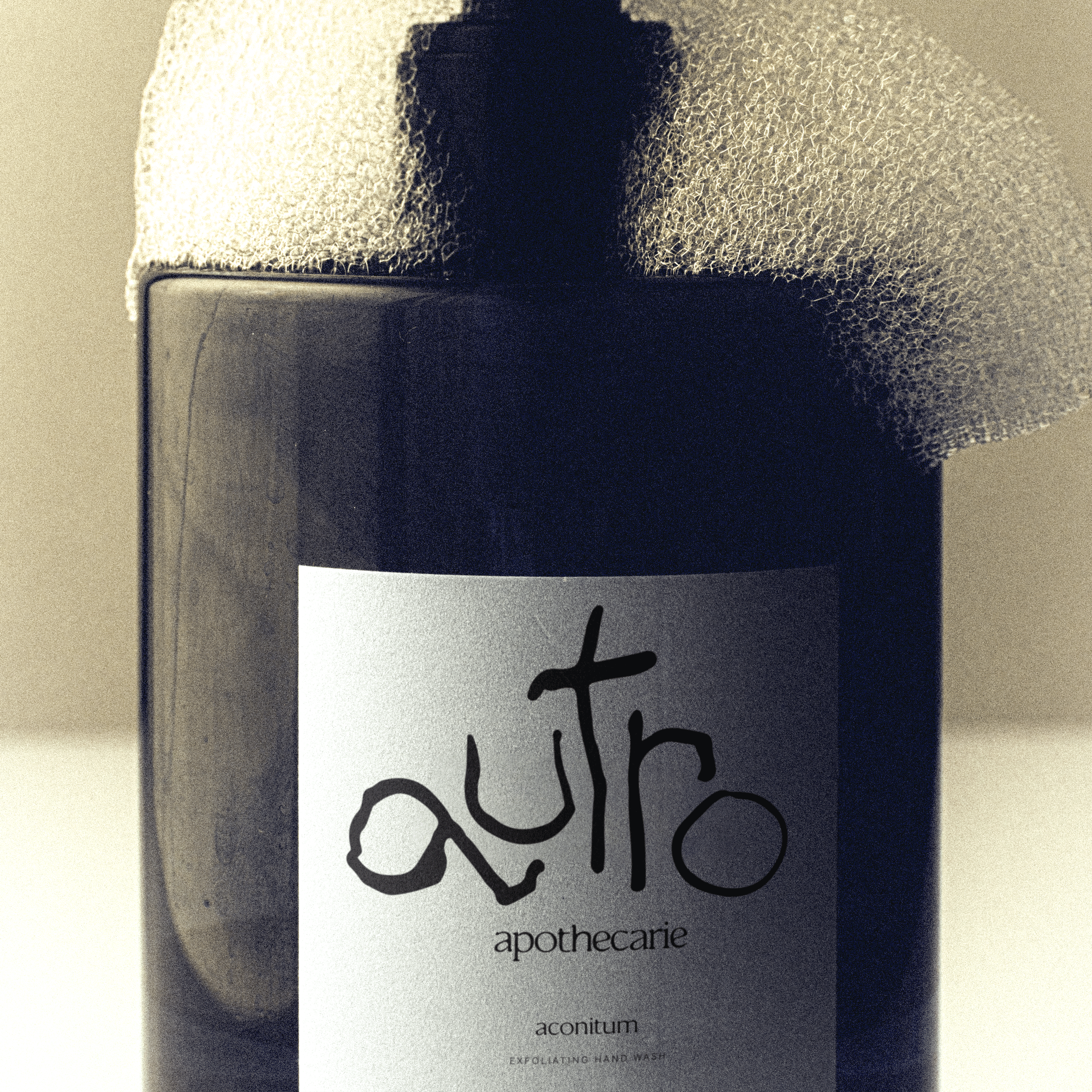
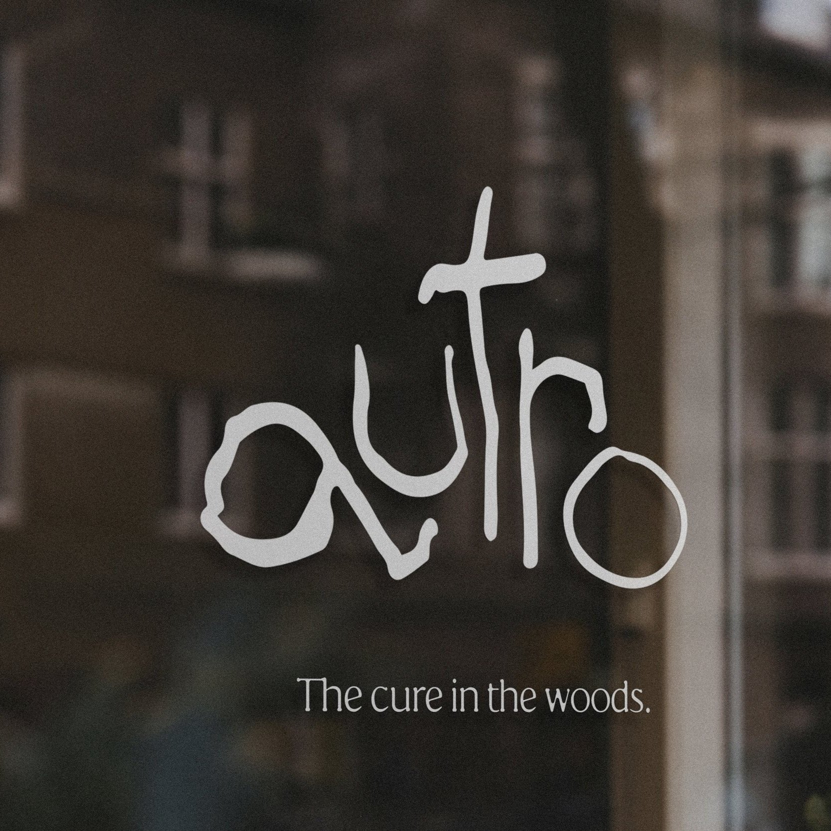
Brand LogoWhere others see thickets, brambles, and branches, we see remedies in waiting. Our logo is a manifestation of this story: it is gnarled, knobby, and crooked. This form resembles the starting point of so many botanicals, which we tirelessly foster and harvest, season after season.
Drawn by hand and assembled by the character, I wanted the logo to feel like battered foliage or stacked kindling. It creates an interesting tension with the rejuvenating, restorative, and nourishing effects of our products.
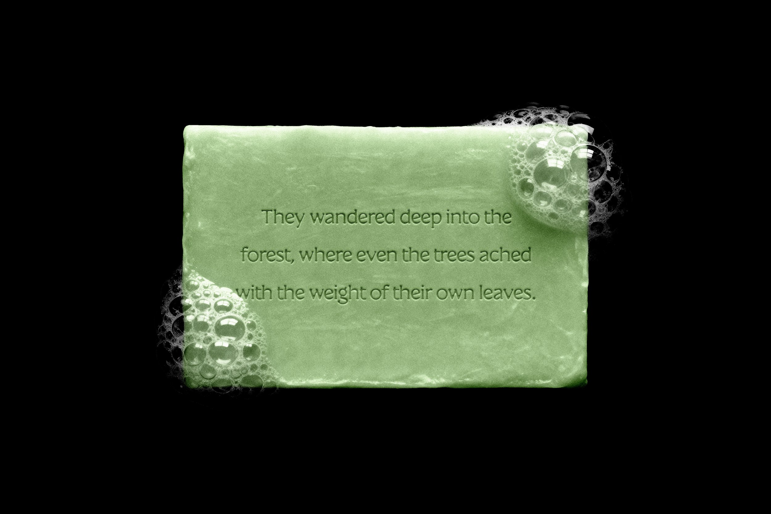
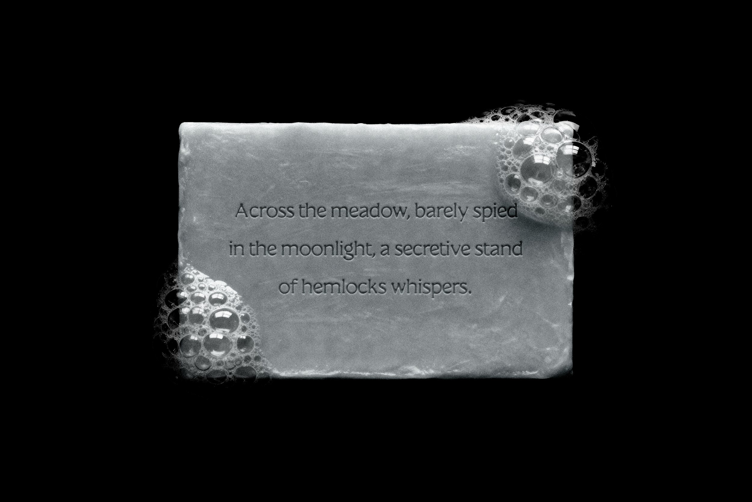
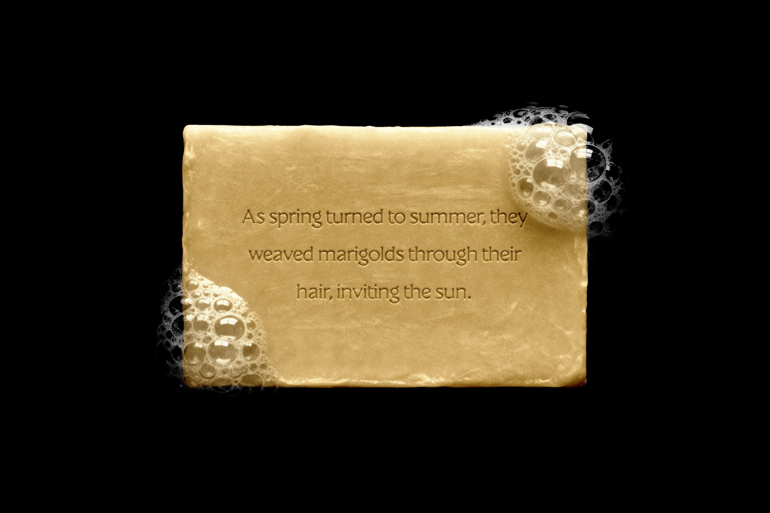
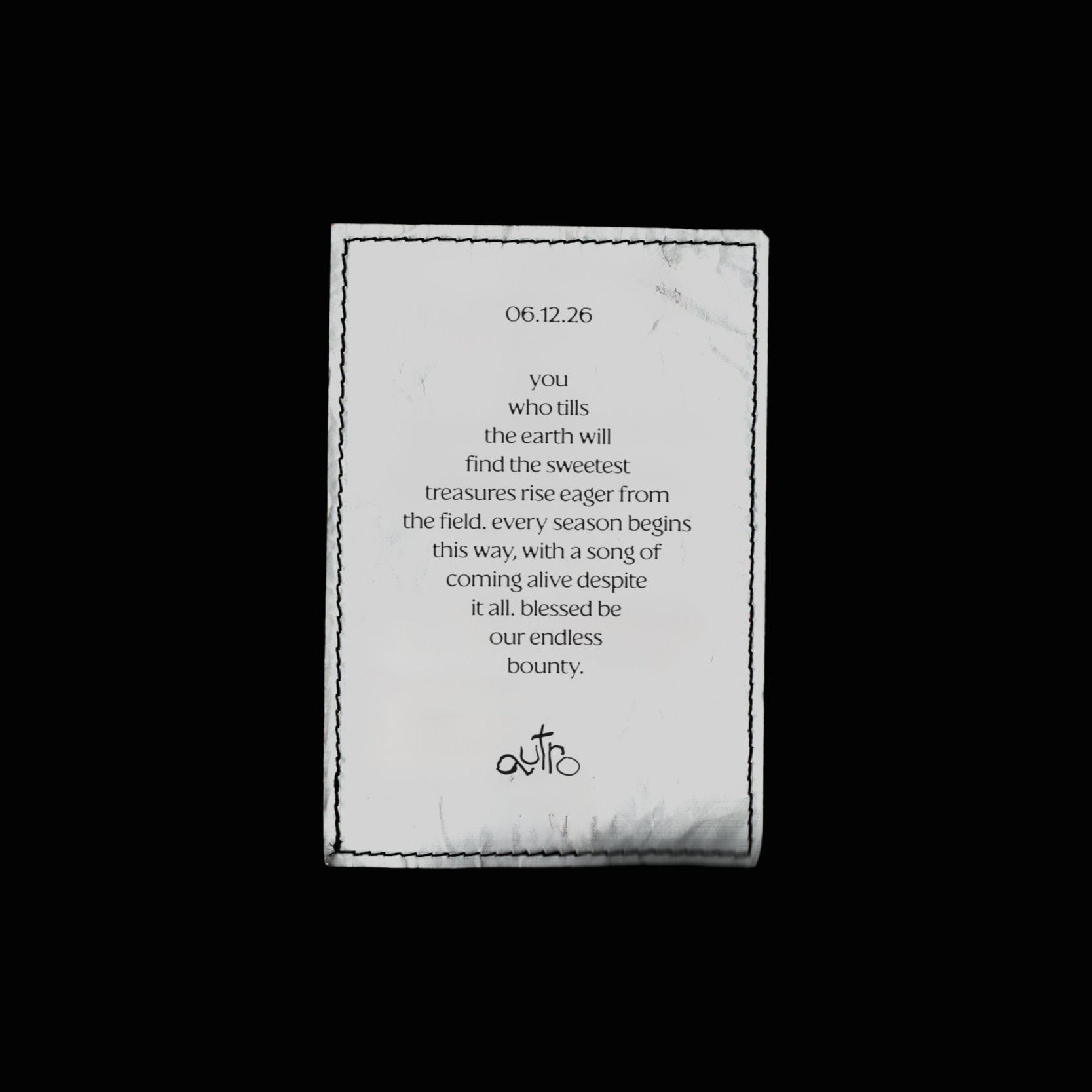
Verbal ExpressionAutro expresses itself in spells, poems, and stories. I didn’t want to try (because I can’t) to replicate the stylings of brands like Slurp Labs or Typology, which have mastered that hermetic, lab-crafted aesthetic so common in cosmetics today. (For the record: I love that shit.)
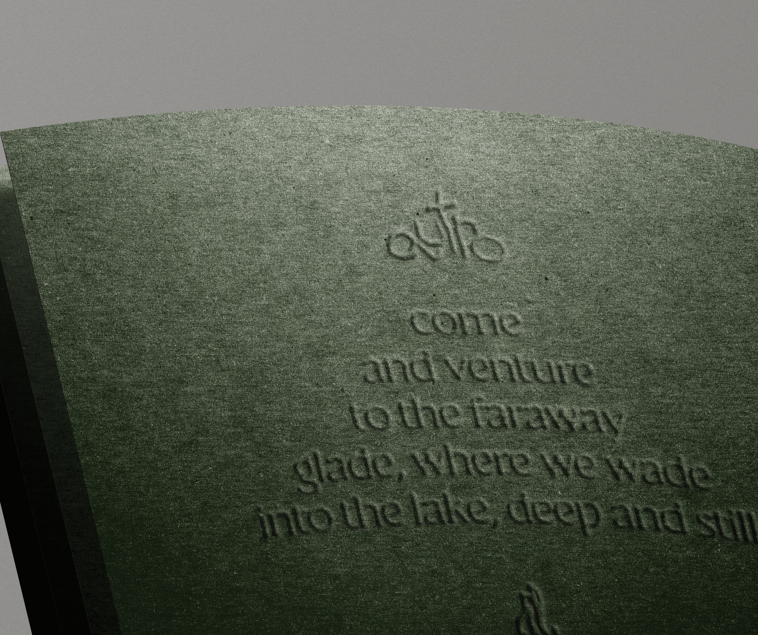
Instead, Autro’s products are described in lush, sweeping images: deep forests, still lakes, flora rifling through the leaves. We are poetic but not academic or multi-syllabic. I wanted to find a voice that felt ancient, alive, and with very little to prove.
In practice, our brand voice is sage-like and mysterious. We embrace obscure sentence structures and timeworn phrasing, and we are far more concerned with evoking a feeling versus explaining ourselves. Our tone is calm and reverent, yet distinguished from the Aesops of the world through its vivid and strangely spellbinding storytelling.
Visual ExpressionI’m a copywriter playing designer here. It shouldn’t surprise you then that type appears to be the biggest design artifact of this brand. Consider the source.
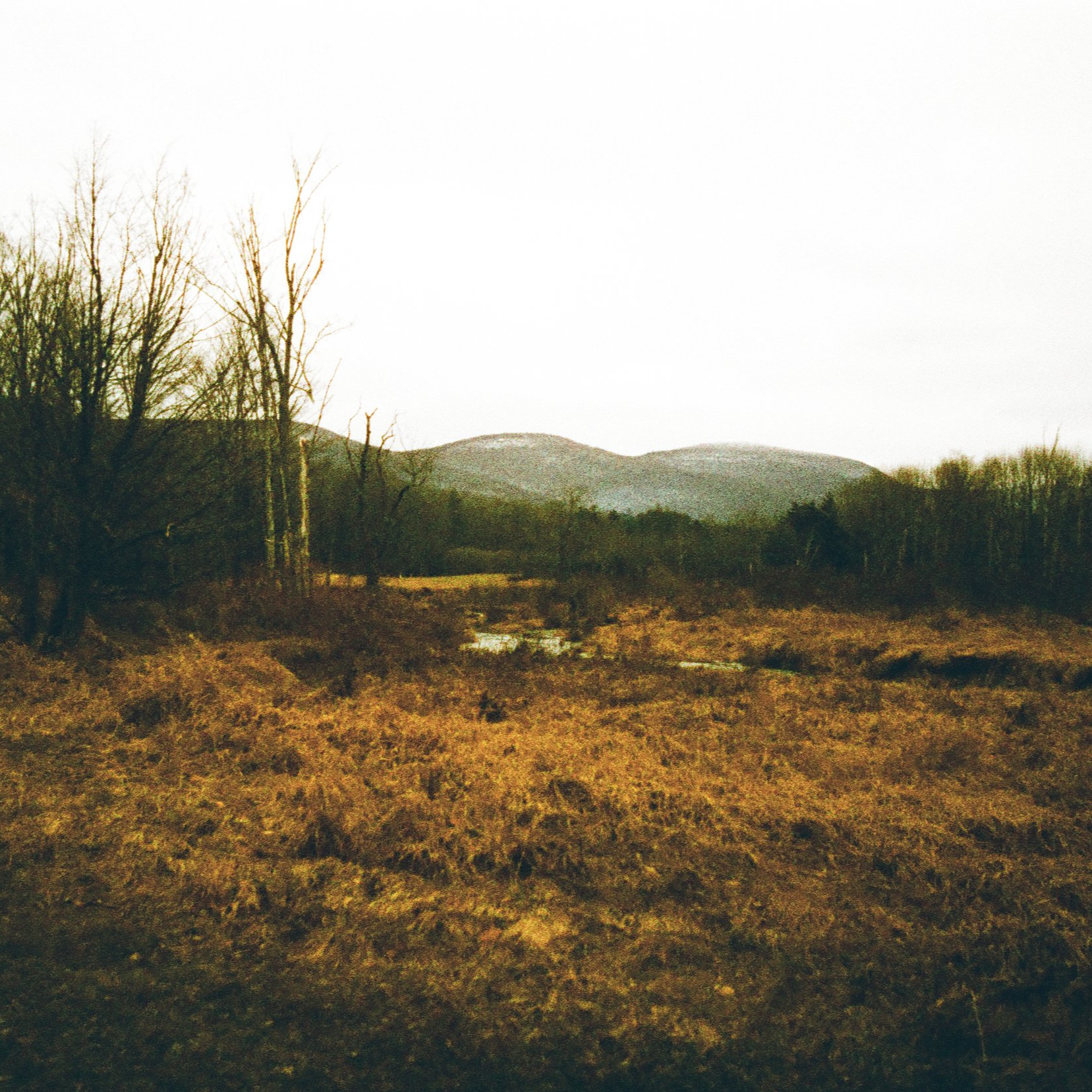
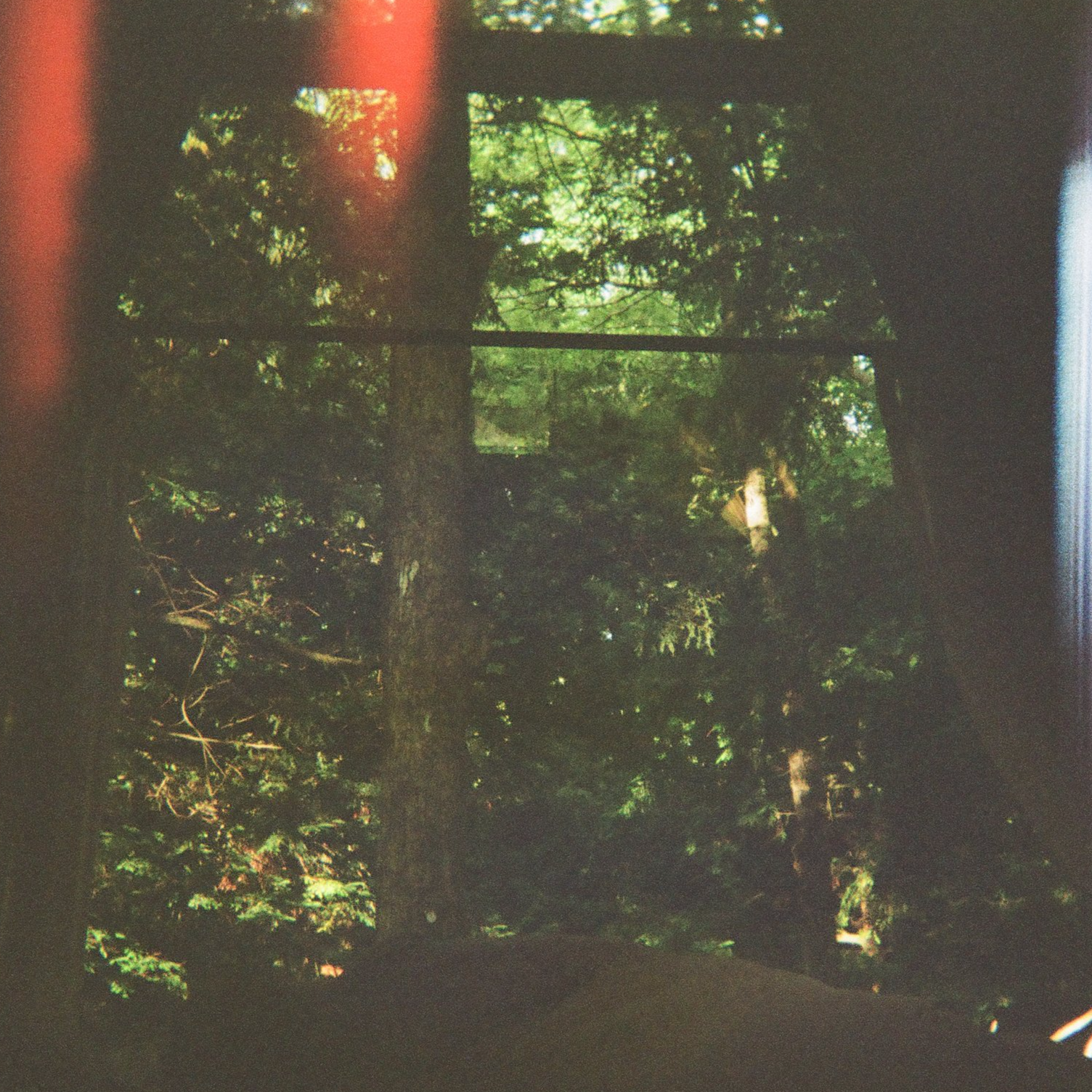
Ultimately, what I wanted to render here was a brand with gravity, intrigue, and a clear tie to the land. Colors are those you might find in nature: straw-like yellows, leafy greens, marigold oranges. A larger color system would borrow from a myriad of botanical flora, giving the brand a whole natural world to explore.
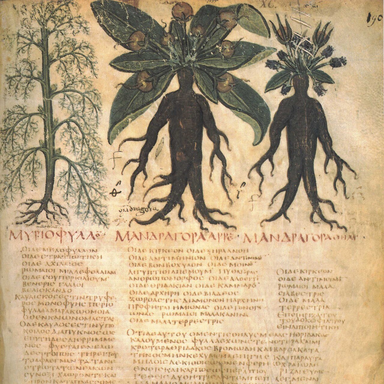
Type is used both as a tool to convey information and as decoration. The diamond- and triangle-shaped type executions above were inspired by illuminated manuscripts and occult texts.
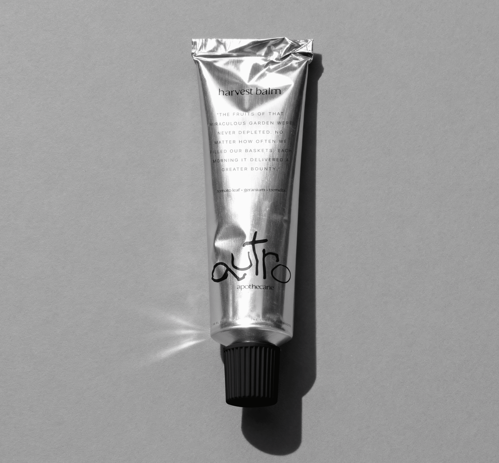
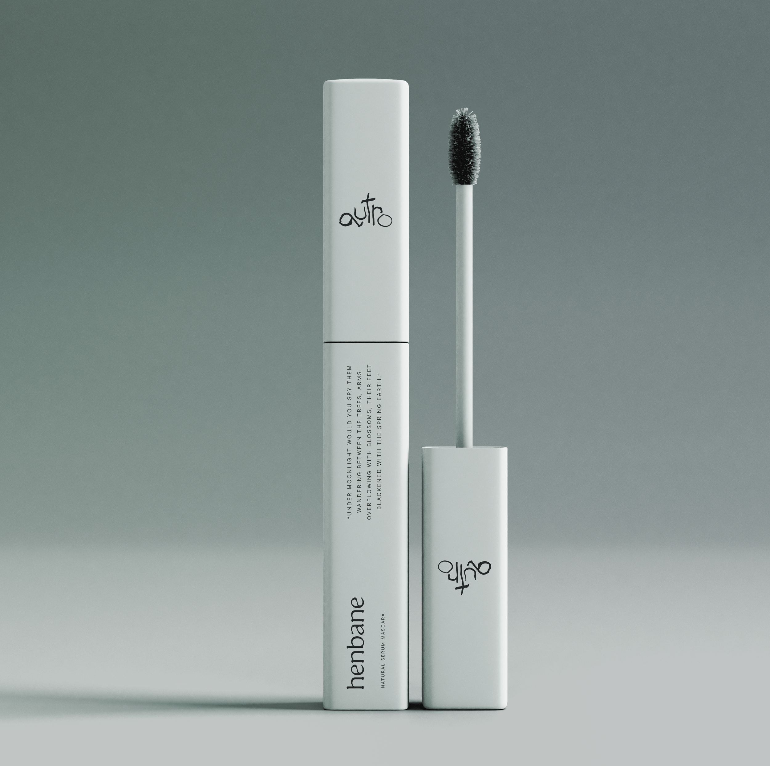
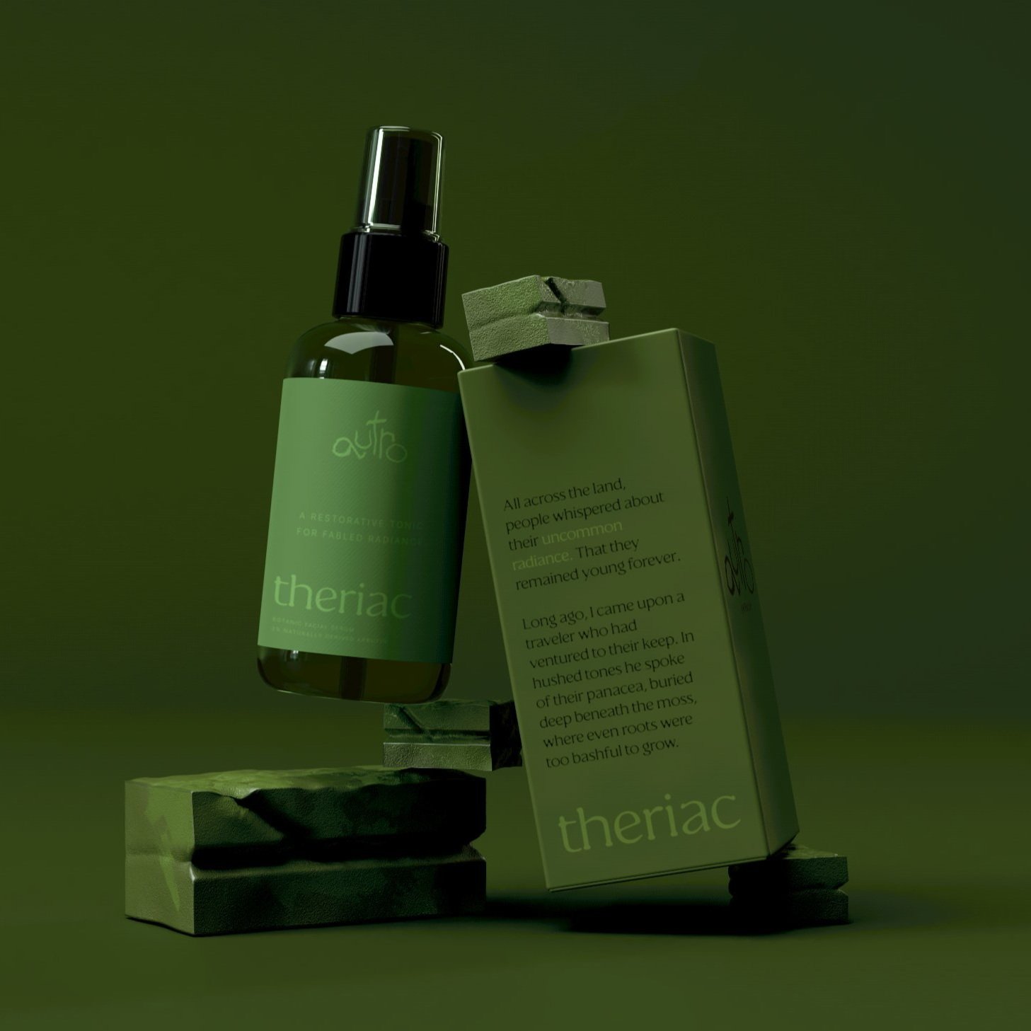
Product NamesThis seems as good a place as any to quickly comment on product names. These mockups offer a glimpse at a few: Harvest Balm, a hand cream; Theriac, a facial serum; Aconitum, a hand wash; and Henbane, a mascara. (The soaps are just… soaps.)
Many of these names have remarkable ties to myth, botany, and magic. Theriac was a universal anti-venom created in ancient Greece, made with viper flesh. Aconitum refers to Wolfsbane, famously toxic and deeply tied to legends of lycanthropy. Henbane is “the witch’s herb”, and thought to be a principal ingredient in flying ointment. Harvest Balm paints a picture of a grand, natural bounty.
You can imagine where this naming approach could take us. Foxglove, calendula, myrrh, nightshade. The opportunities quite literally grow on trees.
Final thoughtsThis experiment is just that — an experiment. And there is surely so much that could be done: illustrations, iconography, and motion all have their place in the brand. I imagine icons of botanic plants or runes; a motion suite inspired by growth itself; videos that play with shadow and light. I have plans to continue exploring. Perhaps this project will expand even further.